
Scrolling through a clunky website on your phone, squinting at tiny buttons, or waiting for slow pages to load can feel like a digital nightmare. We’ve all been there. But here’s the thing: As we’re heading into 2025 it’s not just annoying, it’s easily a dealbreaker for businesses aiming to engage customers.
In this article we’ll break it down. What does mobile-first design mean, and why does it matter so much? We’ll also showcase case studies from Solwey, highlighting how mobile-first design has been successfully implemented to drive results.
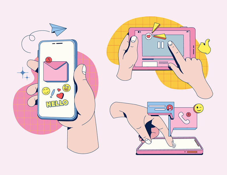
The Mobile-First Reality
Think about how you use the internet. When was the last time you turned on your desktop computer for something that wasn’t work-related? For most of us, the answer is, “I can’t remember.” Whether it’s checking the news, ordering groceries, or scrolling through TikTok, our phones are our go-to devices.
In fact, over half of all internet use happens on mobile devices. That’s huge. If your website or platform isn’t optimized for smaller screens, you’re essentially invisible to a significant portion of your audience. Imagine running a store but locking half the doors and covering half the windows. Not exactly a winning strategy, right?
It gets worse. Search engines like Google prioritize user experience. If your site is slow or hard to navigate on a phone, Google’s algorithms will push it down the rankings. And if your audience can’t find you on Google, they’ll find someone else.
What Is Mobile-First Design?
When you hear mobile-first, especially in the context of frontend engineering, it’s easy to assume it simply means styling components for mobile devices first and then creating overrides with media queries. While this is true, it’s only a small part of what the term really means.
Mobile-first means something more broadly. It means prioritizing the user experience on mobile devices over the experience on desktop.
But why would we want to do that?
The answer is simple: global internet traffic from mobile devices surpassed desktop traffic back in October 2016, and it’s highly unlikely this trend will reverse. Mobile devices—smartphones, tablets, and so on—are here to stay.
This shift means we must adapt and take mobile user experience seriously. But what does that actually involve? It’s a moving target because mobile devices themselves are constantly evolving. Technologies like HTML, CSS, and JavaScript are improving, browsers are advancing, and new frameworks emerge while older ones fade away.
That said, despite this constant change, there are principles we can follow to ensure our projects are mobile-first. These principles go beyond just CSS, JavaScript, or engineering—they span content, design, and performance.
Content
Since mobile screens have far less real estate than desktops, we need to prioritize the most important content. This means identifying the key elements of the product or service and displaying them first, while trimming or deprioritizing less critical content.
Design
Mobile-first design isn’t just about creating mobile layouts before desktop ones. It’s about giving mobile designs the attention they deserve. Are the designs thumb-friendly? Do they follow best practices for navigation? Are clickable elements easy to reach? Are we minimizing popups? These considerations are crucial to delivering a great mobile experience.
Engineering
Most practices that improve website performance also enhance the mobile experience. Techniques like lazy loading, responsive images, reducing server requests, and implementing caching all play a role. While internet speeds have improved drastically, there are still areas with slow or unreliable connections.
Accessibility practices also improve the mobile experience. For example, using appropriate font sizes, ensuring strong color contrast, and designing for touch-based interaction make a significant difference.
In practice, mobile-first design means:
- Clear Navigation: Buttons and menus should be thumb-friendly. Users shouldn’t have to pinch and zoom to click a link.
- Streamlined Layouts: Focus on what matters most. Avoid cramming too much information onto a single page.
- Optimized Speed: People won’t wait for a slow website. Every millisecond counts, so keep your code clean and your images optimized.
- Effective Calls-to-Action (CTAs): Your CTAs should be bold, clear, and impossible to miss. Think of them as the digital equivalent of a flashing neon sign.
Why Speed and Simplicity Matter
Speed is everything. Studies show that users will abandon a website if it takes more than a few seconds to load. On mobile, where distractions are endless, the stakes are even higher. A slow site isn’t just frustrating; it’s a lost customer.
Simplicity is equally crucial. A mobile-first design prioritizes clarity over complexity. It’s about guiding users seamlessly through your site, making it easy for them to find what they need and take action, whether that’s making a purchase, signing up for a newsletter, or sharing your content.
Real-World Success Stories from Solwey
WinWinX: Revolutionizing Peer-to-Peer Transactions
WinWinX is a cutting-edge buy-now-pay-later platform that simplifies peer-to-peer transactions by enabling direct payment installments between buyers and sellers. Their vision was to create a transparent, user-friendly ecosystem where users could confidently buy and sell goods or services without fear of scams or fraud.
When WinWinX approached us, they sought a complete digital transformation. This included reimagining their website, designing their app, and developing both web and mobile platforms. With a diverse user base accessing the platform on different devices, we knew a mobile-first design approach was essential to ensure a seamless experience across all screens.
Our Solution
To deliver on WinWinX’s vision, we focused on:
- Mobile-First Design Principles: Recognizing that most users would engage with the platform on their smartphones, we prioritized responsive layouts and intuitive navigation tailored for smaller screens. This ensured an optimal experience regardless of device.
- Streamlined User Journey: Intuitive workflows and clear communication made it easy for users to explore and engage with the platform’s unique features, such as installment payments and peer-to-peer transactions.
- Custom Development: Tailored backend solutions supported secure, real-time transactions while maintaining scalability.
- Administrative Tools: Robust features allowed administrators to monitor user behavior and maintain platform integrity.
The result was a fully optimized, mobile-first platform that aligned with WinWinX’s mission of transparency and empowerment. By prioritizing mobile usability, we ensured users could confidently navigate and transact anytime, anywhere.
Strands Hair Care: Personalization at Scale
Strands Hair Care redefines the hair care industry by using molecular hair analysis to create custom products tailored to individual needs. Their unique approach combines hair data, scalp condition, and lifestyle factors to deliver a truly bespoke experience.
Strands needed a digital platform that reflected their innovative, personalized offerings. Given the growing trend of mobile shopping, we adopted a mobile-first design strategy to ensure their customers could easily access the platform from their preferred devices.
Our Solution
To bring Strands’ vision to life, we:
- Designed Over 100 Custom Screens: Ensured a cohesive experience across web and mobile platforms, with a focus on usability for mobile users.
- Prioritized Mobile Optimization: From inputting hair data to browsing personalized recommendations, every interaction was designed for touchscreens and small displays without sacrificing functionality.
- Developed a Private Lab Information Management System (LIMS): Streamlined molecular hair analysis data management for accurate, personalized recommendations.
- Created Custom Shopify Themes: Flexible designs optimized for mobile-first navigation, enabling users to browse, customize, and purchase products with ease.
By adopting a mobile-first approach, we empowered Strands’ customers to seamlessly interact with their personalized hair care journey. This focus on mobile usability not only enhanced the customer experience but also positioned Strands as a forward-thinking brand in the competitive hair care market.
The Takeaway
Mobile-first is a comprehensive approach to prioritizing mobile users across content, design, and engineering. A beautifully designed, mobile-friendly website creates a seamless experience for your audience. It’s about meeting people where they are (on their phones) and making them feel like they’re part of something bigger.
In 2025, customer engagement isn’t just about having a digital presence. It’s about creating meaningful connections through thoughtful design and authentic content. Mobile-first design are your keys to standing out in a crowded digital landscape. Ready to take the plunge?
Partner with Solwey for Expert Software Solutions
At Solwey, we are experts in delivering custom software solutions that cater to your unique business needs. With a wealth of experience across industries such as finance, healthcare, retail, and manufacturing, we specialize in creating tailored software that not only meets your requirements but also drives your business forward. Our team understands the nuances of each industry, allowing us to craft solutions that align with your specific challenges and goals.
Whether you're looking to optimize existing tools or build something entirely new, Solwey is here to guide you every step of the way. We work closely with you to understand your pain points and develop a plan that addresses them with precision and efficiency. With our competitive pricing structure, you don't have to sacrifice quality for cost. We deliver high-quality software solutions that fit your budget, and our agile development processes ensure faster delivery, allowing you to adapt quickly to market changes.
Solwey is a leader in mobile-first web development. As mobile usage continues to rise, having a mobile-optimized web presence is essential for staying competitive. Our mobile-first approach ensures that your software and websites are designed with the user experience in mind, providing seamless functionality across all devices. This approach enhances accessibility, boosts user engagement, and improves conversion rates, helping your business thrive in an increasingly mobile-driven world.
With Solwey, you can rely on dependable, ongoing support throughout your digital transformation journey. We are committed to ensuring your software runs smoothly, helping you operate more efficiently and stay ahead of the competition. Let us be your trusted partner in creating the custom software solutions that will empower your business for the future.